
A Good Number, Told Honestly
National polling data can be a genuinely useful hook, if you resist the urge to oversell it. This template pairs a strong stat with a caveat that keeps it credible, then lands on the same action every template in this library ends with: make a plan, bring someone with you.
What's in the template
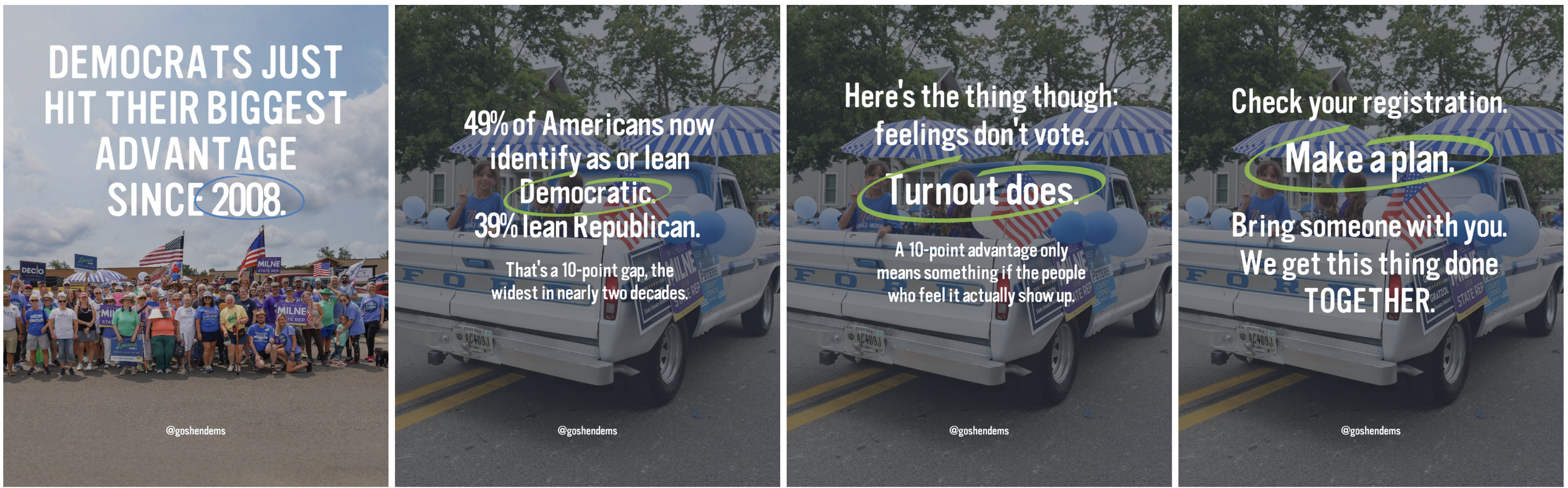
Slide one opens with the headline: Democrats just hit their biggest advantage since 2008, with the year circled for emphasis. It's a scroll-stopper, but it's also specific and checkable, not a vague "things are looking up."
Slide two breaks down the actual numbers: 49% identify as or lean Democratic, 39% lean Republican, a 10-point gap, the widest in nearly two decades.
Slide three is the part that makes this template trustworthy instead of just optimistic: "feelings don't vote, turnout does." A 10-point advantage only means something if the people who feel it show up. That honesty is what separates this from a hype post, and it's the reason someone might actually trust the next stat you post too.
Slide four closes with the same three-part instruction that runs through this whole library: check your registration, make a plan, bring someone with you.
How to customize it
Photos. Swap in real photos from your own events, a parade, a canvass, a rally, anything with actual members of your group. This matters more here than in most templates, since real, specific photos are part of what makes a big national stat feel locally grounded rather than borrowed.
Your handle, in place of @goshendems.
The stat itself, and this is the one to watch. Unlike the evergreen templates in this library, this one is built on a live, time-sensitive number. Before you repost it, check whether newer polling has come out. Don't reuse a stale number just because the template already has one filled in, that undercuts the exact credibility this format depends on.
Your source line. Always cite where the number came from and, if you're relying on reporting rather than the original data, credit that too, the way this version credits both Gallup and The New York Times.
A note on staying honest with the data
The strongest thing about this template isn't the headline stat, it's that it doesn't stop there. It includes the caveat that a party-ID shift doesn't automatically mean higher turnout, and it names why, the shift is being driven by independents who lean rather than committed partisans, a group historically less reliable at the polls. If you adapt this template with a different stat, keep that same instinct: state the good number, then be straight about its limits. That's what makes the call to action at the end feel earned instead of tacked on.
suggested caption
Because this is national data, you can use this as-is, the data and sourcing stay the same for every group using this template, just swap in your own hashtags.
Good news, with a catch.
New Gallup polling shows 49% of Americans now identify as or lean Democratic, compared to 39% Republican, a 10-point advantage, the party's largest in Gallup's tracking since 2008.
But as Gallup and The New York Times both note, party identification shifts don't automatically translate into votes. The people driving this shift, mostly independents who lean rather than committed partisans, also tend to be less likely to turn out.
So the advantage is real. Whether it matters is still up to us.
Check your registration. Make a plan. Bring someone with you.
#BringYourPeopleToThePolls #[YourLocalGroup] #Vote[YourState] #ElectionDay2026
Source: Gallup, Quarterly Party Affiliation, as reported by The New York Times
